Building games with React Native: Creating an intuitive and invisible UX
In this series, we are building a reusable setup for game development in React Native and explore a range of game design topics that are special for React Native and Javascript-based games.
Part 1: Setting yourself up for repeated success
Part 2: > You are here <

In the previous part of this series, we set up the foundation for our project. We implemented Redux, React Navigation and the basic flow from splash screen over user login to the actual game.
There is one caveat though. What we did create was neither pretty nor an enjoyable experience and it’s high time for us to change that.
Here’s the outline of what we’re doing today:
- Jazz up out SplashScreen
- Improve the UX for the app startup (for impatient gamers)
- Create beautiful layouts with custom backgrounds, titles and buttons
- Implement persistent storage
- Make the game look pretty
0) GitHub Links
Get your project ready to code along!
Before we start; I did some small cleanups and updated a few packages to fix newly found security issues since last time. If you did code along with the last part of this series, I advise you to take a look at the changes I’ve done since we left off. For the rest of you, feel free to grab my existing repository at this version tag on gitHub.
Throughout the tutorial, I will post GitHub links to my commits if you want to compare your own progress.
On folder structure and naming things
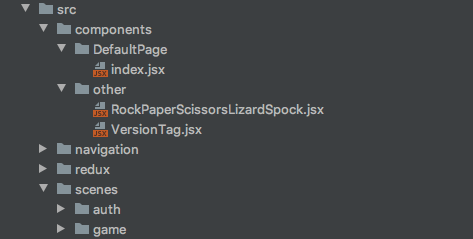
Last time, we’ve kept most things very basic and did lots of stuff “inline”. As we are moving on, I will make some small adjustments to keep things a bit better organised. As you might be well aware of, folder structure and naming is difficult and much discussed in programming, even more so in react, as the library doesn’t force any constraints on us. Some people differentiate between “smart” and “dumb” components or between containers and components. Others strictly adhere to the idea of a function or module-based structure.
None of those is right, wrong or better for everyone so decide for yourself what best suits your preferences. For the duration of my tutorials, you are at the mercy of my own concept of order…
1) The splash screen + 2) UX
This is the first thing the user sees when he opens the app. Right now there are two splash screens, one is only an image that gets displayed by default when the expo app starts and the other is the one we added ourselves.
The splash screen should only be shown a few seconds and we’ve already implemented that last time. For the impatient gamer (believe me, there are many of those, myself included) our pretty logo might not be as interesting and impressive as it is to us and rightly so.
In commercial apps, stacking multiple of these screens is something you see a lot, especially if there are developers, producers, investors and peeps holding the ownership to the used intellectual property in cases of games about known IPs like Transformers, Disney or Marvel. You don’t want to wait for all of those to slowly auto cycle through, do you? I don’t!
A new component
What we need is a component that spans the whole screen, is pressable and accepts any content. This is something we’re going to need every now and then so let’s build a new component for better reusability.
Under src/components/ we will make a new folder for global/layout/ components. Here we’re going to store all components that can be reused in different places (global) and serve layout functionality and we can, later on, move our DefaultPage component as well.
Using the TouchableWithoutFeedback component from react-native, we are creating an element that can react to user input and will take up the whole available space.
Create a new component called TouchableWrapper.jsx under components/global/layout/ and apply some basic styles to it to fill all available screen given by the parent element. We’ll pass on any children passed in as props and require a handlePress function as well.
You might as well use the default TouchableWithoutFeedback component but I prefer it this way because I’m going to use this setup a lot and this way I don’t need to repeat the styling and such for every use case.
Implementation
Moving on to our already existing sceneSplash.jsx we need to wrap our whole page in this new TouchableWrapper and pass in our navigation event. This way the user can click the splash screen to skip the automated navigation delay.
Let’s also add a logo to our splash scene to make it a little bit more appealing. I’m using my own logo here so feel free to use or create your own or use a placeholder for now.
Cleaning up old timers
Before we move on, there is one more thing. We need to make sure that the original navigation event is no longer triggered when the user clicks to navigate before the timeout triggers. Otherwise, there will be two navigation events and we can’t let that happen, can we?
We need to add a cleanup to our useEffect that clears the timeout when the screen is left. Now here’s a small problem. When you work with react, you can use useEffect and return a function that automatically gets called when the component is destroyed. As we are using navigation stacks, the old page is still in the navigation stack, none of the components on that page gets unregistered and hence the cleanup function of our useEffect would never be triggered. It took me a while to figure this one out when I first tried to use this in a navigation stack. But worry not, there are hooks to the rescue.
React Navigation gives us the useFocusEffect hook which works more or less like the useEffect hook but triggers it’s cleanup when the scene is no longer on top of our stack. Additionally, we need to wrap everything in a useCallback hook to make sure that our code is only run once when the scene comes into focus and not every time it re-renders while in focus.
This is important, don’t forget to use the useCallback hook! Seriously!
GitHub commit:
added TouchableWrapper and debounced navigation
3) Custom backgrounds and better layout
We are currently using our DefaultPage component for all pages. It’s time to create a new Component to work with full-width background images.
Before we start, let’s quickly rename and move our old DefaultPage/index.jsx to global/layout/DefaultPage.jsx to clean up our old code a bit.
A new page layout
We are creating a new global/layout/BackgroundPage.jsx and while this, again, might feel like overkill for using the already existing ImageBackground component, this way we can easily replace our solution in one place when we need to use a better solution.
There is one thing that irked me when writing this component. If you take a look at the propTypes, you’ll see that the type of background is number. The reason for this is that when the image is required/imported, it is assigned a reference number for the import. If you use it within the component where you imported it, you are usually not aware of this but if the image is supplied by the parent as a prop, you need to declare the propType for the background image as a number for this very reason.
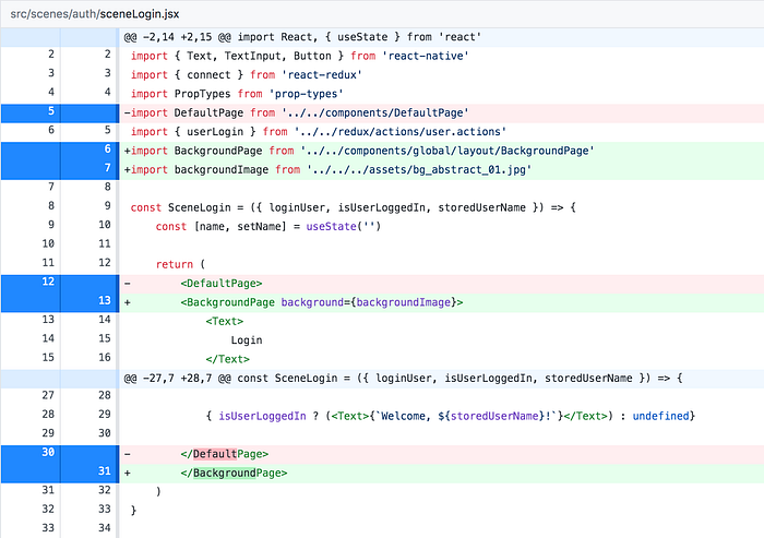
In our sceneLogin.jsx, we replace our DefaultPage with the new BackgroundPage and add a background image from our assets. As always, you can find my assets on my GitHub repo or use your own.
I’ll write a guide on how to size and implement full screen and flexible images that don’t stretch and retain their original resolution scaled down to the device size and pixel density. For now, just make sure the background doesn’t warp too much and looks good on most devices.
A little bit more style
We could continue to use one of the default Button components that emulate the device’s OS style but when you build games, you usually want to create your own UI elements. We will start using custom buttons later but for now, let’s replace the default react-native button component with our own.
We know that we need a handler for press events, a title and it would be nice if we could use a set of predefined designs that we will call type. So we already know what props are required for our basic Button implementation.
Looking at the following code, you can see that we’re using destructuring to create our style object from the baseButton CSS object and another one that we grab from the styles object by using the type prop. We’ll do the same for the text styling.
Why types and enums are great…
The CSS styles on this one look a bit unwieldy but using an enum style propType for type as seen above, we can make define what legit type strings will be accepted and in case of a faulty type property by using PropTypes.oneOf([…]) with an array of legit strings.
This has two advantages. For one we get notified in the expo app (during debugging) when we use a type prop of the wrong “type” and additionally your IDE might pick up on those propTypes and offer autocompletion as seen in the IntelliJ IDE screenshot below. This is incredibly helpful and one of the reasons, I will at a later time show you how to migrate your project to typescript. You don’t have to use it but if it floats your boat and fits your style of working, it can be an asset during development.

Going back to our sceneLogin.jsx we need to replace the Button with our TextButton component and for better readability, we’ll add a wrapper and some style to the scene.
GitHub commits:
a) added BackgroundPage component and cleanup
b) added TextButton component and some style
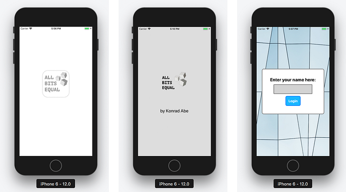
With this, we already checked off 3 points from our list. Our next topic is less visual but no less important.
4) Implement persistent storage
When working with redux, the store is initialised with what you define as the initial state in your reducers. Currently, we don’t have any relevant initial state but wouldn’t it be nice if the user stayed logged in until he manually logged out, even after closing and reopening the app?
There are multiple ways to store information when working with react native and both iOS and Android have separate solutions for this. Luckily Expo takes care of the OS related differences and we can concentrate on the redux part of our app.
AsyncStorageis an unencrypted, asynchronous, persistent, key-value storage system that is global to the app. It should be used instead of LocalStorage.
We’re going to use redux-persist to rehydrate our redux store with persisted data so we need to grab that package from npm to continue.
npm install redux-persist# version: 6.0.0 at the time of writing
Before we get started, CLEANUP!
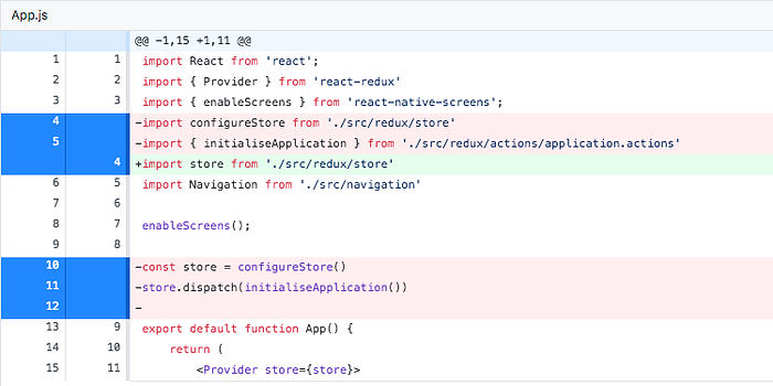
Open our redux/store.js and get rid of the boilerplate initialState object and compose function. We’re only working with our own middleware so we can use applyMiddleware() directly in our createStore() function and, to keep the App.js cleaner, let’s export the store directly instead of our configureStore function.
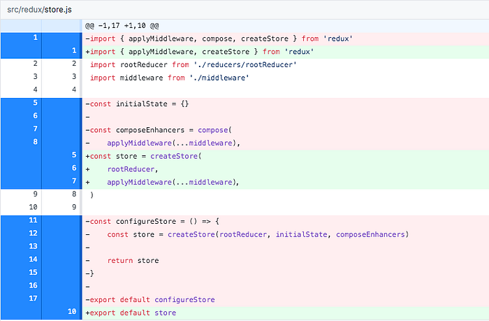
According to our now cleaner store.js, we need to directly import the store in our App.js and we get rid of the dispatched initialiseApplication action. We’re going to write a new and better solution for this in a moment.
Making our store persistent
We can now grad the persistStore and persistReducer from redux-persist and use them to create a persistent wrapper around our redux store. The configuration for redux-persist can be very simple in our current use case. We need a key string and need to define where/how to store the information.
As previously mentioned, we will be using the AsyncStorage from react-native, in which case Expo will take care of the OS specifics and we don’t need to meddle with any platform-specific implementations.
Instead of configuring the store with our rootReducer, we will now let redux-persist handle our reducers and create our store with the new persistedReducer.
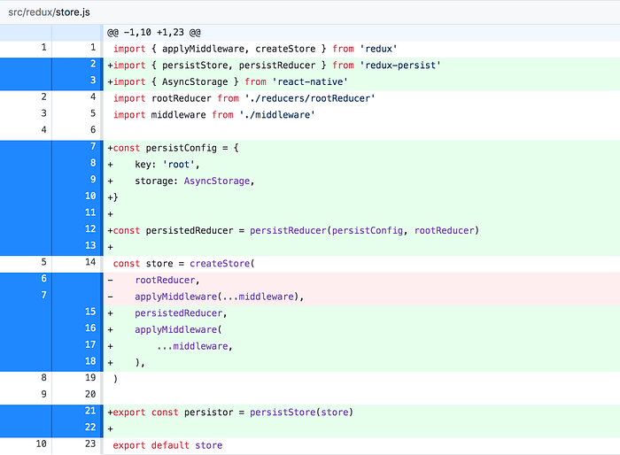
As you can see, we also create and export a “persistor”. We’re going to use that in our App.js in just a moment.
By using redux-persist we also have access to the PersistGate component, specially made for react applications. By putting the PersistGate as a wrapper between our store Provider and our Navigation (containing our actual app), we can make sure that nothing inside the PersistGate is rendered until the store received it’s persisted data.
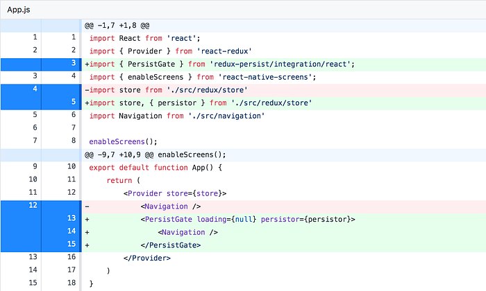
PersistGate has a loading property which is currently set to null. The loading prop accepts either null or any valid react component and whatever we out here will be shown until the store is ready, which in our current case would be null and render nothing.
To check if the persisted store is working, simply continue to the login, enter a username and press login. If you restart the app, even if you completely kill the Expo task and restart it with npm start, once you reach the SceneLogin again, you should be greeted by your previously entered username.
Adding a loading screen to the gate
For the PersistGate loading screen, it is important that we don’t use anything from our store, so only a simple and not connected component should be used. In most cases you won’t even see this as redux-persist should be done within a few milliseconds.
While we are at it, we include the StatusBar component from react-native. This little helper allows us do set the status bar of our device to hidden, effectively hiding the top bar with battery, network and time. Depending on your preference you can skip this test but as we can access those values via the Expo API and recreate them ourselves I usually prefer to hide the device’s defaults and integrate those into my own design and ui.
Here’s our final App.js:
And this is the final store.js:
GitHub commits:
a) added redux-persist and cleaned up store.js and App.js
b) added persisted store data
c) added loading screen and removed status bar
Bonus: Go with the flow
As we now have a persistent store, we should bypass the login screen when the user is already logged in and we should add a logout button too.
This first part is super easy. We already store the user login so we just have to connect our SceneSplash and choose the next page depending on the login state.
If you previously logged in and restart the app, the splash screen will now automatically navigate to the home screen. Let’s quickly add a logout button there and delete the username in our user.reducer.js on logout.

Additionally, we want to navigate to the login screen when the user logs out. We’ll adjust our user middleware accordingly.

GitHub commit:
added logout and improved navigation for returning users
5) Make the game look pretty
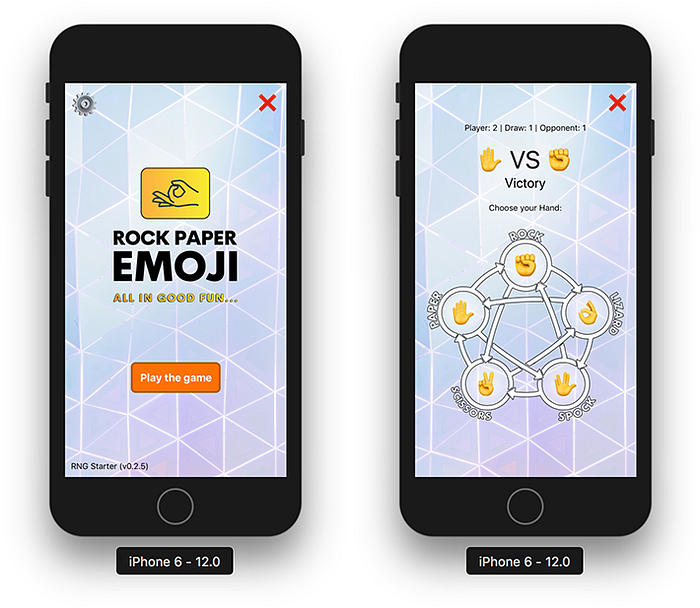
Our current home screen still looks kind of bland. Let’s quickly add a background, some visuals and do something about those ugly buttons.
Prettify the home screen
We can simply grab our previously built TextButton, BackgroundPage and a new background image (from my repository or use your own) to replace all Buttons and the DefaultPage. Also, throw out the boring <Text>Home</Text> and replace it with our fancy logo as an Image.
Isn’t that so much better? How about we add a new button type for settings and log out too. You can reuse parts from our TextButton.jsx if you want to save a few minutes of typing.
Here’s what I came up with for a simple IconButton that accepts an icon (some Emoji) and optional additional size and styling as props to allow for absolute positioning and such.
For the button’s text/icon part, I’m combining default styles I defined (via spread operator) with an optional size prop that has a default value of 18. This way we have sensible and easily expandable defaults and still keep it customizable when used.
We can now use this IconButton component with some positioning in our SceneHome.
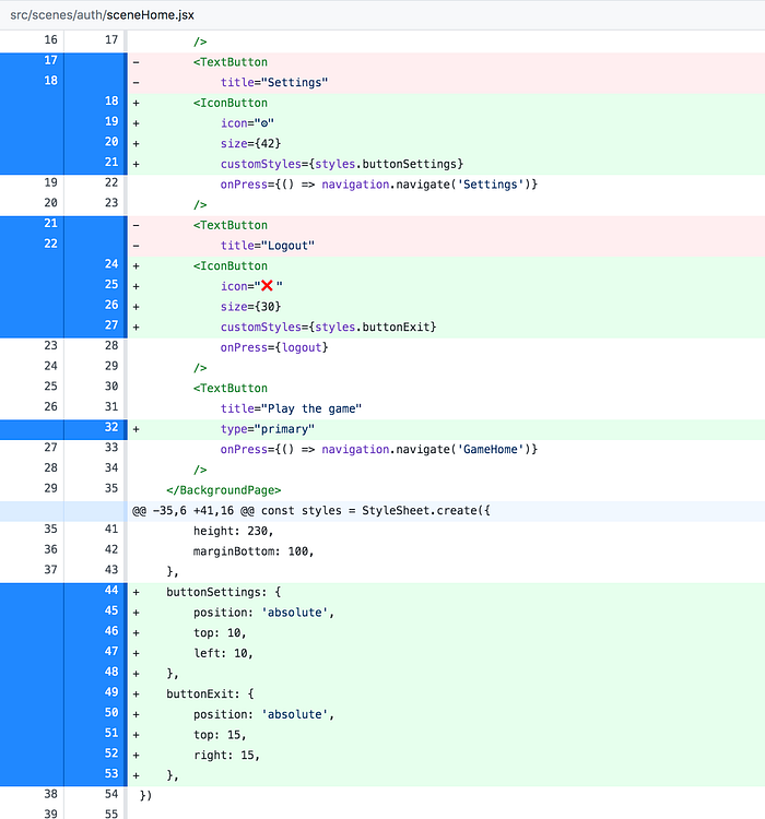
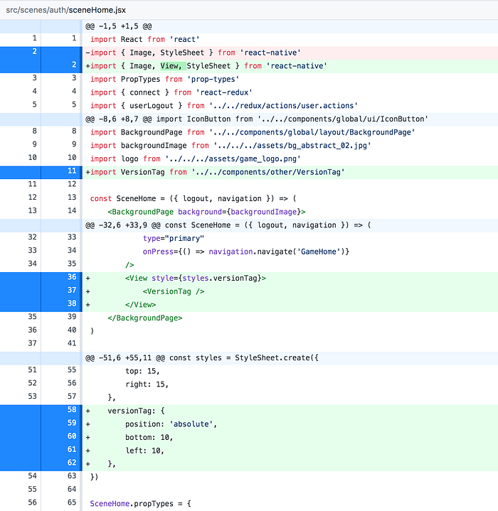
If you want to recreate your typical game home screen, feel free to add our good old VersionTag again too.
Jazzing up the game
For the SceneGameHome I won’t go into every detail as it’s mainly what we’ve done before. So without further ado, here’s the new code…
I’ve put a bit more work into the “game” too. I mainly added a new background for the Emoji Buttons and rewrote parts of the file to allow for dynamic association of Emoji hand sign, type/name and respective CSS for positioning.
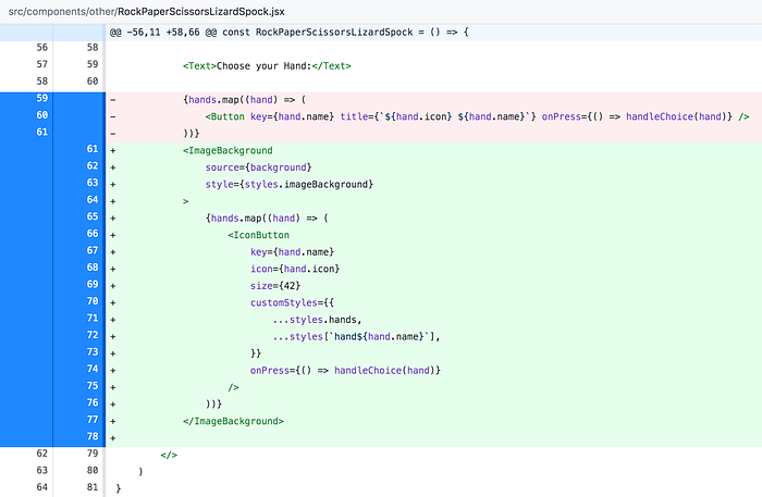
As you see I still map through the hand icons but now I’m using the new IconButton here too and I’m building the styles for each icon by spreading the default styles and the respective hand’s styles into the customStyles prop.
You can download the game’s background image from my repo here.
For the positioning of the icons, I’m using math to make sure I can change the size of the image background container and icons and still keep them centred in their positions/circles. If I want to adjust the sizing, I can simply change the values of diameter (background image circle) and circleRadius (icon circle).

GitHub commits:
a) jazzed up sceneHome.jsx with new images
b) added IconButton.jsx
c) added VersionTag to SceneHome
d) made the game pretty
Wrapping up and Coming up next
I think it’s time to call it a day. We’ve greatly improved both style and user experience and made our store persistent.
>> Final Code on GitHub v0.2.0
Next time we’re going to dive deeper into navigation stacks, versioning and data validation/updates. This sounds a bit dry but it’s the third and last part of our setup for now and when we’re done with that, we can use all this to start with the actual game building and prototyping. I’ve got a few game concepts lined up, just to tease you a bit, so stay tuned and see you next week.
Things we will build in the following weeks:
- Copy Clicker | the Idle Incremental Game
- IF | Interactive Fiction as a Game
- Match 3 | Block-Based Logic Game
- Hex Builder | Hex based Grid Building Game
- many more
Some words about me:
If you want to see more of my work and progress, feel free to check out my series on building a React Native Web App with Hooks, Bells, and Whistles with Expo SDK33. I’m also currently working on a new series about building more complex and scalable apps using React/Redux, where I’ll go into details about how and why I do stuff the way I do as well as some articles on my experience in building games for web and mobile with React.
Here are some of my recent topics:
- Spread & Rest Syntax in Javascript
- clean and simple Redux, explained
- Game Theory behind Incremental Games
- Custom and flexible UI Frames in React Native
And if you feel really supportive right now, you can always support me on patreon, thus allowing me to continue to write tutorials and offer support in the comments section.
